One idea drives everything below: the codebase is the design file. You will not draw a mockup and hand it to an engineer to rebuild. You will build the real screens, in the real repo, with an AI agent doing the coding. Engineering reviews your work the way they review each other's: as a pull request they can run.
The handoff is where design dies. Every spec loses detail. Every rebuild re-solves problems you already solved. When the screen you design is the screen that ships, there is nothing to lose in translation.
Install an agent harness
A harness reads your files, writes code, and runs commands when you ask in plain English. This tutorial uses Claude Code. Codex, Hermes, and Cursor work the same way, and everything you build here works in all of them.
First, install Node.js (22 or later) from nodejs.org if you have not already. The project in step 2 needs it, and it gives you the npm command the next line uses. Then open your terminal and run:
npm install -g @anthropic-ai/claude-code
claude
Sign in when it asks. That is the whole install. Anthropic's own default is a one-line installer, curl -fsSL https://claude.ai/install.sh | bash, which needs no Node.js and updates itself; either route gives you the same claude command.
Do not agonize over the choice of harness. Everything you write in this tutorial is a plain file in your repo, so it works in any of them, and you can switch later without redoing a thing. Terminal tools are the preference here; desktop apps are catching up fast.
Go deeperTools overview compares all four harnesses, and Keep it portable explains why the choice barely matters.
Start the project
Ask the agent to set up the project. Type this, word for word if you like:
Create a new Next.js project in this folder with TypeScript,
Tailwind CSS v4 (CSS-first config, no tailwind.config file),
and shadcn/ui installed. Use pnpm. Initialize
a git repository. Then start the dev server and tell me the
local URL.
The agent will run the installers, answer the setup questions, and start a server. Open the URL it gives you (usually localhost:3000). You should see a starter page.
Two of those names matter to you. shadcn/ui is a library of well-built interface components: buttons, inputs, dialogs. You will theme them instead of building your own. Tailwind CSS v4 is the styling system; its entire configuration lives in CSS files, which means your design decisions live in files you can read.
Take a sixty-second tour before moving on. Ask: "List the folders in this project and tell me what each one is for, one line each." The three you will care about: /app holds the pages, /components/ui holds the shadcn components, and /styles will hold your design tokens.
And start one habit right now: whenever a "check before you continue" passes, tell the agent "commit this with a clear message." Each commit is a save point. When an experiment goes wrong later, you rewind to the last one instead of untangling the mess.
git log shows one commit.Write brand.md
Everything the agent builds will only be as good as what it knows about your brand. So before you build anything, write it down. One file, plain text: /skills/brand.md.
Gather your colors as hex values, your typefaces and weights, your icon style, and three words that describe your tone. If your brand lives in a PDF or a Figma file, copy the values out as text. Then structure the file like this:
# /skills/brand.md

## Identity
Product: [name] and one sentence on what it does.
Tone: [three words, e.g. warm, direct, human].

## Typography
Primary typeface: [name]. Weights: 400, 500, 600.
Type scale (px): 12, 14, 16, 20, 24, 32.

## Color
brand-500: #[your primary]  (CTAs and active states only)
neutral-50: #[off-white]    (page backgrounds)
neutral-900: #[near-black]  (body text)
danger / warning / success: #[one hex each]
Rule: neutral surfaces about 80% of any screen.
Brand color about 10%. If a screen looks colorful,
there is too much brand color.

## Iconography
Library: Lucide. Stroke 1.5px. Outline only, never filled.

## Motion
No animation unless it communicates state.
150 to 250ms. Always respect prefers-reduced-motion.
Be specific. "Blue-ish" produces mush. #2C5EE8 produces your blue, every time, on every screen.
Already have a brand? Hand over what exists
You do not have to retype anything. The agent reads files and images, so give it what you already have and let it do the extraction:
- Drag files straight into the terminal. A logo SVG, a folder of icons, a brand guidelines PDF. Say: "Extract the colors, type, and rules from these into /skills/brand.md."
- Paste screenshots. A palette from your website, a style tile, a slide from the brand deck. The agent reads the hex values out of pixels.
- Point at your live product. "Read the CSS at [yoursite.com] and pull out the color palette and type scale." Your shipped product is often the truest record of your brand.
- Connect Figma. If the brand lives in a Figma library, connect the Figma MCP server (ask the agent to set it up) and say: "Read the variables and text styles from my Figma library and draft brand.md."
- Inherit a company design system. If your team publishes tokens as a package or a site, point at it: "Install @company/tokens (or read [design-system-url]) and generate brand.md from it." Your project then speaks the same language as the rest of the company from day one.
Whatever the source, the destination is the same plain-text brand.md. Read what the agent extracted and correct it; extraction is a draft, not a verdict.
No brand yet? Build a starter brand in an hour
If you just read "gather your colors" and realized you have no colors, do not stop to run a branding project. Use the agent you installed in step 1. It is a competent brand consultant when you make it interview you first:
Interview me to create a starter brand. Ask one question at a
time: what the product does, who it is for, three words for
the tone, and two brands whose look I admire and why.

Then propose three brand directions. For each: a short name,
a palette in hex (primary, neutrals, danger, warning, success),
one Google Font with weights, and a sentence on how it feels.

Then build a page at /brand-preview that shows all three side
by side: color swatches, type samples, and a sample button and
card in each direction.
Open /brand-preview in your browser and pick the direction that feels most like your product. Push back on whatever is off ("direction two, but warmer neutrals and a less corporate font"). When it looks right, say: "Write /skills/brand.md from direction two." Done. Notice what just happened: you generated options, judged them in a browser, and turned the winner into a file. That is the whole workflow in miniature.
Prefer a dedicated tool? Coolors or Huemint generate palettes, Fontjoy pairs Google Fonts, Realtime Colors previews a palette and type on a realistic layout, and Looka will make you a quick logo. All fine. Just bring the results home as hex values and font names in brand.md; the file is the brand, not the tool.
And do not let the perfect brand block you. A starter brand is a decision you can revise, not a tattoo. Every value you pick becomes a token in step 5, which means a rebrand later is an afternoon of editing one file, not a rebuild. Pick, move, refine when the product tells you more.
Go deeperPrepare your brand input has the complete worked brand.md: logo rules, illustration and photography direction, approved contrast pairs, and a shortcut that reads your brand straight out of Figma.
Write the instruction file
The instruction file is the standing brief your agent reads at the start of every session: what the project is, where things live, and the rules it must never break. Write it once in AGENTS.md, an open format every major harness reads. Claude Code reads it directly, and a one-line bridge file makes that certain in every session.
# AGENTS.md

## What this project is
[Product name]: [one sentence]. Mobile web first.

## Rules. Never break these.
1. Never hardcode a color or spacing value.
   Use the CSS variables in /styles/tokens.css.
2. Never install a package without asking first.
3. Never push to main. All work on branches.
4. Touch targets: 44px minimum.
5. Every animation respects prefers-reduced-motion.

## Read before designing
Brand: /skills/brand.md

## Current status
[Update this every session: what is in progress,
what is next, what is undecided.]
Then add the bridge file so every session picks it up:
echo "@AGENTS.md" > CLAUDE.mdThe "Current status" section matters more than it looks. Update it at the end of every session. It is how tomorrow's session, or a teammate, or a different harness picks up exactly where you stopped.
brand.md is the first of what the playbook calls skills: one plain-text file per domain of judgment. As your project grows you will add copy.md for voice, a11y.md for accessibility rules, and components.md for your library. Same pattern every time. When you catch yourself explaining the same thing to the agent twice, that is a skill file asking to be written.
Go deeperSkills & instruction files covers the full skill system, including how to make skills load automatically. Keep it portable explains the AGENTS.md standard and the resume-anywhere workflow it unlocks.
Scaffold the design system
Now the payoff. One prompt turns your brand file into a working, themed design system:
Read /skills/brand.md carefully before starting.

Scaffold a design system using shadcn/ui and Tailwind CSS v4.
Generate:

1. /styles/tokens.css: CSS variables for all colors, the type
   scale, a spacing scale on a 4px base, radii, and shadows.
   Define values in :root and .dark.
2. /styles/globals.css: map the shadcn component colors to our
   tokens in an @theme inline block.
3. Themed shadcn components: Button, Input, Card, Badge,
   Alert, Select, Dialog. Install them with the shadcn CLI.
4. A living style guide page at /design-system that shows
   every token and component.

Follow the color proportions in brand.md.
Flag any color pair that fails accessibility contrast.
When it finishes, open /design-system in your browser and ask one question: does this look like my brand, or does it look like every other starter kit? If it looks generic, the fix is almost always in brand.md. Add the missing specifics and ask the agent to regenerate.

That tokens.css file is now the single source of truth for how your product looks. Change a value there and every screen follows. Guard it.
Go deeperScaffold the design system covers the post-generation review checklist and why this system doubles as the agent's context. Publish your design system site turns that style guide page into the reference engineering bookmarks instead of Figma.
Fix accessibility in the tokens
The cheapest place to fix a contrast problem is the token file, before a single screen uses the failing pair. Run this now, not after you build:
Read /styles/tokens.css. Test every foreground and background
color pair against WCAG 2.2 contrast ratios. Output a table:
passing pairs, failing pairs, and for each failure a suggested
replacement hex that passes AA and stays close to the brand.
Apply the fixes I approve to tokens.css.
One change in tokens.css fixes every component that uses that pair. The same fix made screen by screen is ten times the work, and you will miss one.
Go deeperAccessibility audit adds the component-level audit (focus, keyboard, touch targets), the a11y.md skill file, and the weekly screen-level sweep.
Export tokens for engineering
Engineering should get your design decisions as data, not as a screenshot. There is a standard format for this: DTCG, the W3C design token format that Style Dictionary, Tokens Studio, and Figma all read.
Read /styles/tokens.css. Generate /tokens/design-tokens.json
in the W3C DTCG format. For each token include the value, the
type, a one-line description, and the CSS variable it maps to.
Send that file to your engineering lead today, even though you have not built a screen yet. It tells them what is coming, in a format their tools already understand, and it starts the collaboration before there is anything to argue about.
Go deeperExport design tokens explains the three-layer token structure and how to keep the export in sync as the system evolves.
Build your first flow
Pick your most important user journey. Onboarding, checkout, whatever your product lives or dies by. Name the screens it needs, then ask for all of them at once, rough but complete:
Read /skills/brand.md. Build the [onboarding] flow: [welcome,
account, preferences, done]. Use only our themed shadcn
components and tokens. Rough is fine. I want the whole flow
end to end before we refine anything.
One rule for the content: real copy from the first draft. No lorem ipsum, no "[headline here]". Placeholder text hides layout problems and has a way of shipping. If you do not know what a screen should say yet, ask the agent to draft it and then edit its words like you edit its spacing.
Review in the browser, not in the code. Then give feedback the way you would to another designer. The agent understands design language:
- "The form feels dense. Give the fields more room to breathe."
- "The primary button does not read as primary. Make it the one obvious next step."
- "This error state feels like a slap. Make it calm and tell the user what to do next."
Say what you like too, not just what to fix. "The progress indicator on step three is exactly right" gives the agent a reference to match everywhere else.
Two techniques will save you hours. First: for any screen you are unsure about, ask for three versions before choosing one. Options cost minutes; committing to the wrong one costs days. Second: when a screen is still wrong after three rounds of feedback, stop fixing and reframe. Say "forget this version; what is the simplest screen that achieves the goal?" Iterating on a bad approach polishes a bad approach.
A flow is done when every screen has its empty, loading, and error states designed, it holds up at 375px wide, and there is no placeholder text anywhere. Not before. If you skip the error states, engineering will invent them without you.
Go deeperPrompt like a Designer is a full vocabulary for this feedback (contrast, density, type, feel, layout, interaction patterns). Build major flows covers the flow-by-flow method, and When things go wrong names the four ways sessions go sideways and how to recover.
Make the agent check its own work
Your agent can look at the screens it builds. Give it a browser and it will catch its own mistakes before you see them. In Claude Code, connect the built-in preview or the Playwright MCP server (ask the agent: "set up Playwright MCP so you can see the running app"). Then make this the standing order:
Walk the onboarding flow in the browser. Screenshot every
screen and every state. Flag anything that is broken, off
brand, overflowing, or inconsistent with tokens.css. Fix
what you find and show me before and after.
This closes the most annoying loop in AI-assisted work: code that passes every check and still looks wrong. Words describe what you want. Screenshots prove what you got.
Go deeperThe playbook's Tips & tricks covers the full screenshot discipline, plus the harness features (plan mode, checkpoints, hooks) that make exploration safe and the loop-engineering frame that ties your checks into one system. That frame also covers cheap automated verifiers: decision models such as TypeSafe's Jev, which answer a pass-or-fail question about a screen in milliseconds, so the gate can run on every iteration.
Put it on a live URL
Until now everything lives on your machine. Time to get the link. Two moves: put the repo on GitHub, then connect it to Vercel.
Install the GitHub CLI if it is missing, then walk me through
gh auth login. Create a private GitHub repository named
[product-name] and push everything to it.
Then go to vercel.com/new, sign in with GitHub, import the repository, and accept the defaults. Two minutes later you have a URL.
From now on this happens automatically: every branch you push gets its own preview URL, and it is the most useful artifact in this whole workflow. Send it to a friend. Open it on your phone. Show it in a meeting. Nobody needs an account, an app, or an explanation. What they see is not a picture of the product. It is the product. A link beats a video: the person you send it to can click through it themselves.
Go deeperDeploy & environments covers the environment ladder, password-protected previews, and tagging deploys so you can always recover exactly what a tester saw.
Ship it as a pull request
Open a pull request. Ask the agent to do the ceremony:
Push this branch and open a pull request. Write the
description with three sections: what changed visually and
why, how it was built (components and tokens used), and what
engineering should verify (edge cases, accessibility, mobile).
This PR is your handoff. Not a Figma link. Not a spec document. A diff engineering can run, review, and merge like any other code. Ask your engineering lead for a 24-hour review turnaround, and agree on one rule up front: changes to shared components need their approval; new screens built from existing components just need their awareness.
Working alone? Open the PR anyway. Sleep on it, then review your own diff in the morning before merging. The discipline is the point: a written record of what changed and why, and one moment of judgment between "done" and "shipped."
Go deeperHandoff & dev collaboration covers the full PR template and review-gate matrix. Designing on real code is the advanced version: designing directly against engineering's production repo.
Set the weekly rhythm
Everything so far was setup. This step is the habit that makes it compound. Every Friday, thirty minutes:
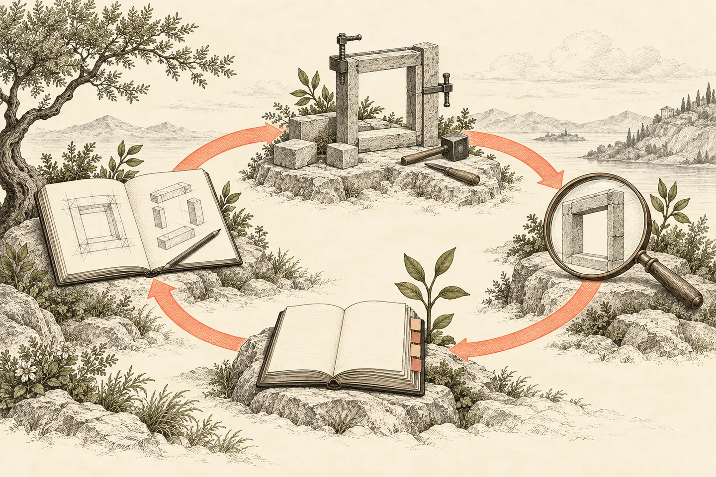
- Ask the agent to scan every screen for hardcoded values that should be tokens, and fix them.
- Re-run the accessibility audit from step 6 across all screens.
- Regenerate design-tokens.json if anything changed, and tell engineering.
- Ask: "Read this week's git log and write a changelog entry: what was added, changed, and fixed."
- Update the "Current status" section of AGENTS.md.
Each pass takes minutes because the agent does the reading. What you get back is a design system that never drifts, a changelog that writes itself, and a project any teammate can pick up on Monday morning.
Check before you continueYou have run one full Friday pass and the changelog entry is committed.
One habit to add in week two: the decision log. Every time you make a call that future-you will question (why ghost buttons in modals, why this spacing scale), have the agent log it to a file. Six months of those entries is institutional memory no Slack thread can match.
Go deeperGit sync & design rhythm is the full weekly system: branch discipline, change classification, escalation. Decision log & changelog sets up the memory.
When it goes sideways
Four problems account for most stuck moments. Here is the two-line fix for each.
- The screens look generic. The agent did not read your brand file. Say: "Read /skills/brand.md and /styles/tokens.css, then redo the last task." If it keeps happening, move the instruction into AGENTS.md so it is automatic.
- The dev server shows an error. Copy the whole error and paste it to the agent, verbatim. Say "fix this." Usually it does. When it can't, it tells you exactly what to ask an engineer.
- The agent wants to install a package. Your rules already require it to ask. Say no unless it explains why nothing already in the project can do the job. Bloat arrives one reasonable-sounding install at a time.
- Something broke and you do not know when. This is why you commit at every checkpoint. Ask: "Compare against the last commit and tell me what changed." Or rewind to the save point and take the last step again, smaller.
For everything past these four, the playbook keeps a full chapter: When things go wrong.
Where this tutorial ends and the playbook begins
This tutorial is the on-ramp. The full playbook is the operating manual: the same twelve moves, plus the judgment, the failure patterns, and the practices that only matter once the basics work. Here is the map.
| Tutorial step | Playbook chapter | What the playbook adds |
|---|---|---|
| 1. Harness | Tools overview, Keep it portable | All four harnesses compared; the resume-anywhere operating model |
| 2. Project setup | Tools overview | Why Vercel and GitHub are the other two daily drivers |
| 3. brand.md | Prepare brand input | The complete worked file: logo, illustration, photography, motion |
| 4. Instructions | Skills & instruction files | The full skill system: copy, a11y, components, auto-loading |
| 5. Scaffold | Scaffold, Publish the system | Review checklists; the living design system site engineering bookmarks |
| 6. A11y | Accessibility audit | Component and screen-level audits; the a11y skill file |
| 7. Tokens | Export tokens | Three-layer token structure; keeping exports in sync |
| 8. First flow | Prompt like a Designer, Build major flows, Canvas views | The full feedback vocabulary; pattern extraction; reviewing flows at a glance |
| 9. Verification | Tips & tricks, When things go wrong | Loop engineering; plan mode, checkpoints, hooks; recovery patterns |
| 10. Live URL | Deploy & environments | The environment ladder; protected previews; tagged deploys for testing |
| 11. The PR | Handoff, Designing on real code | Review gates; designing directly on the production repo |
| 12. Rhythm | Git sync & rhythm, Decision log | Branch discipline; escalation rules; institutional memory |
| Beyond | Localization, Performance, Team & governance, appendix | Everything the tutorial never touched: copy audits, multi-agent work, metrics loops, scaling to five designers |
Read the full playbook when you are ready for depth. Send the 13-slide brief to the stakeholder who needs convincing. And ship something this week.